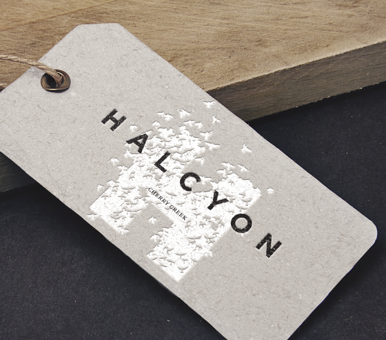
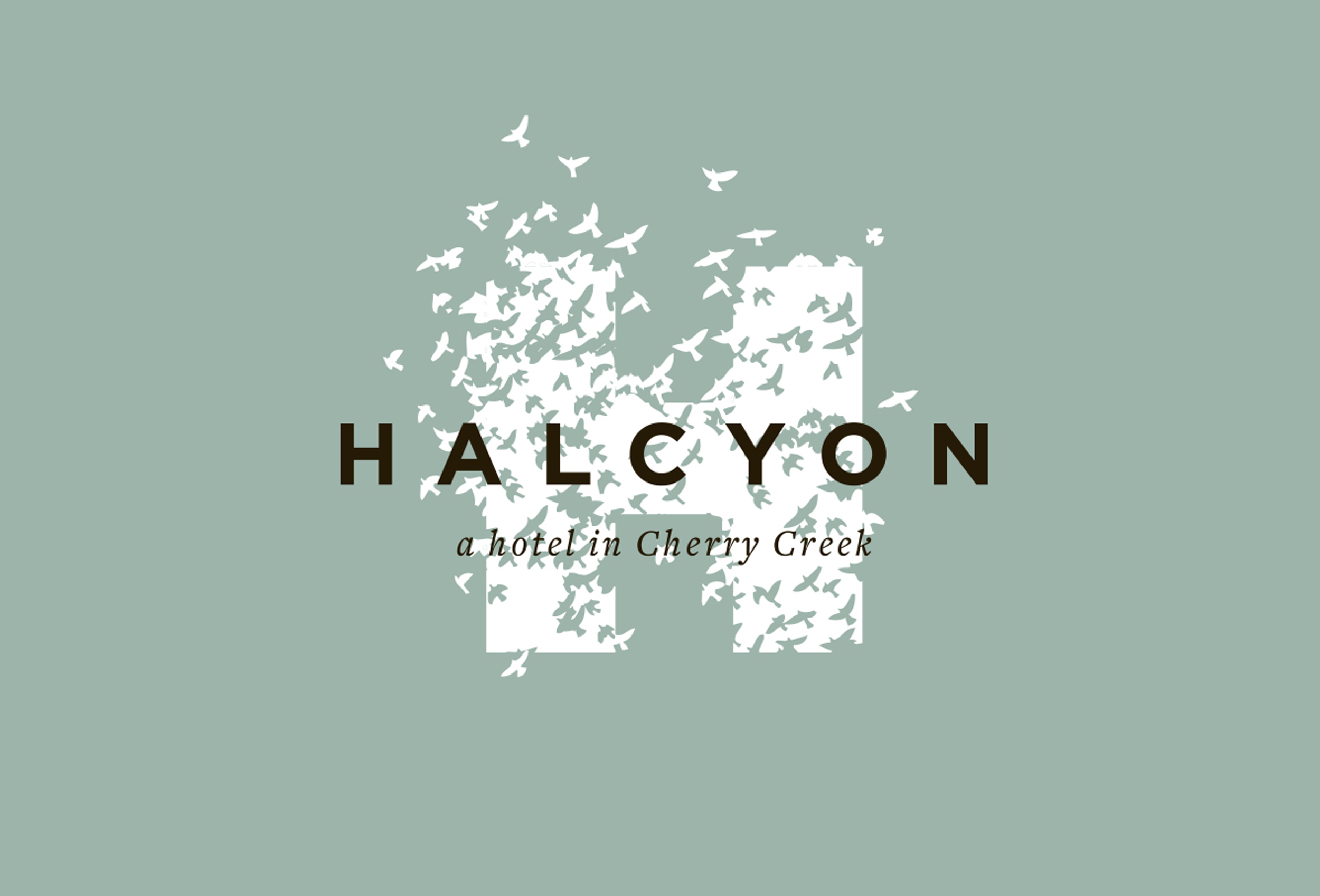
HALCYON HOTEL IN CHERRY CREEK
Stepping across the threshold of Halcyon’s front door instantly feels like entering a friend’s fabulous home as a very welcomed guest. I helped build the brand strategy for Halcyon to elevate the concept of hotel-as-home and engage the guest in surprising ways.
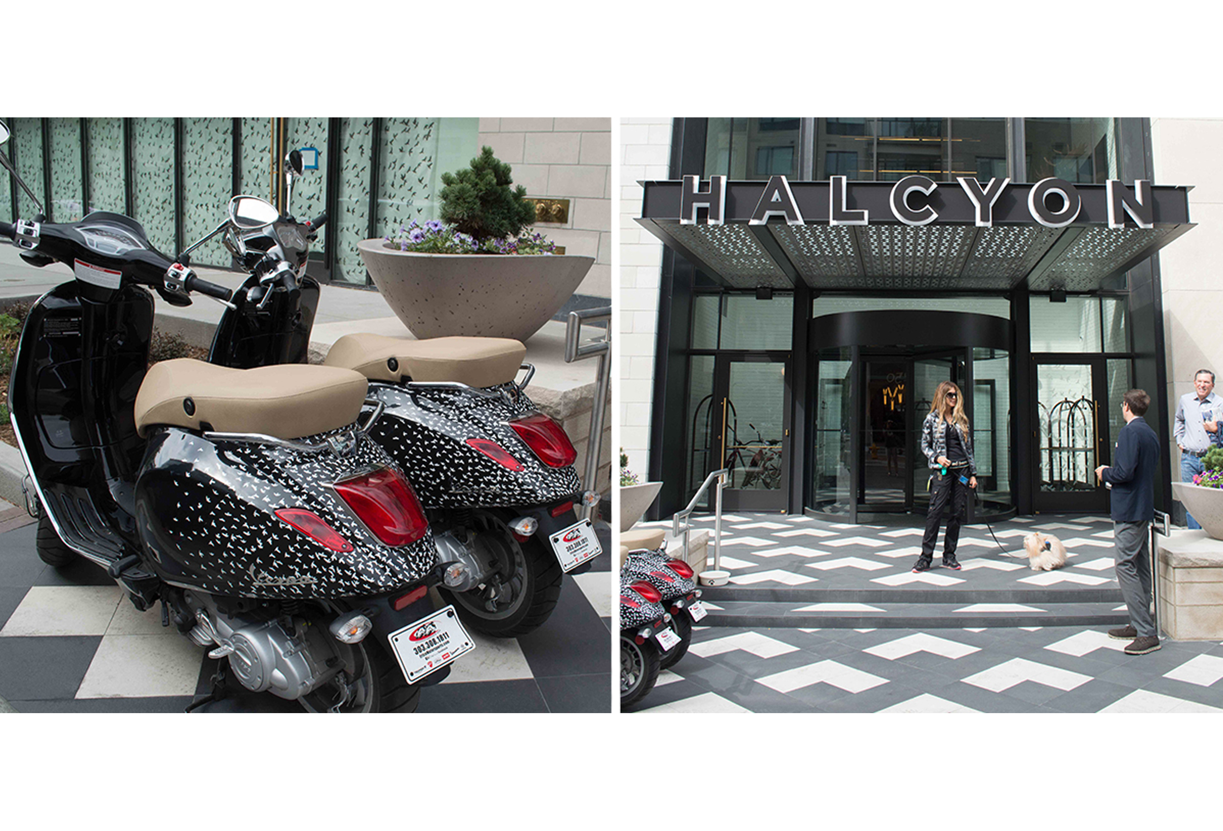
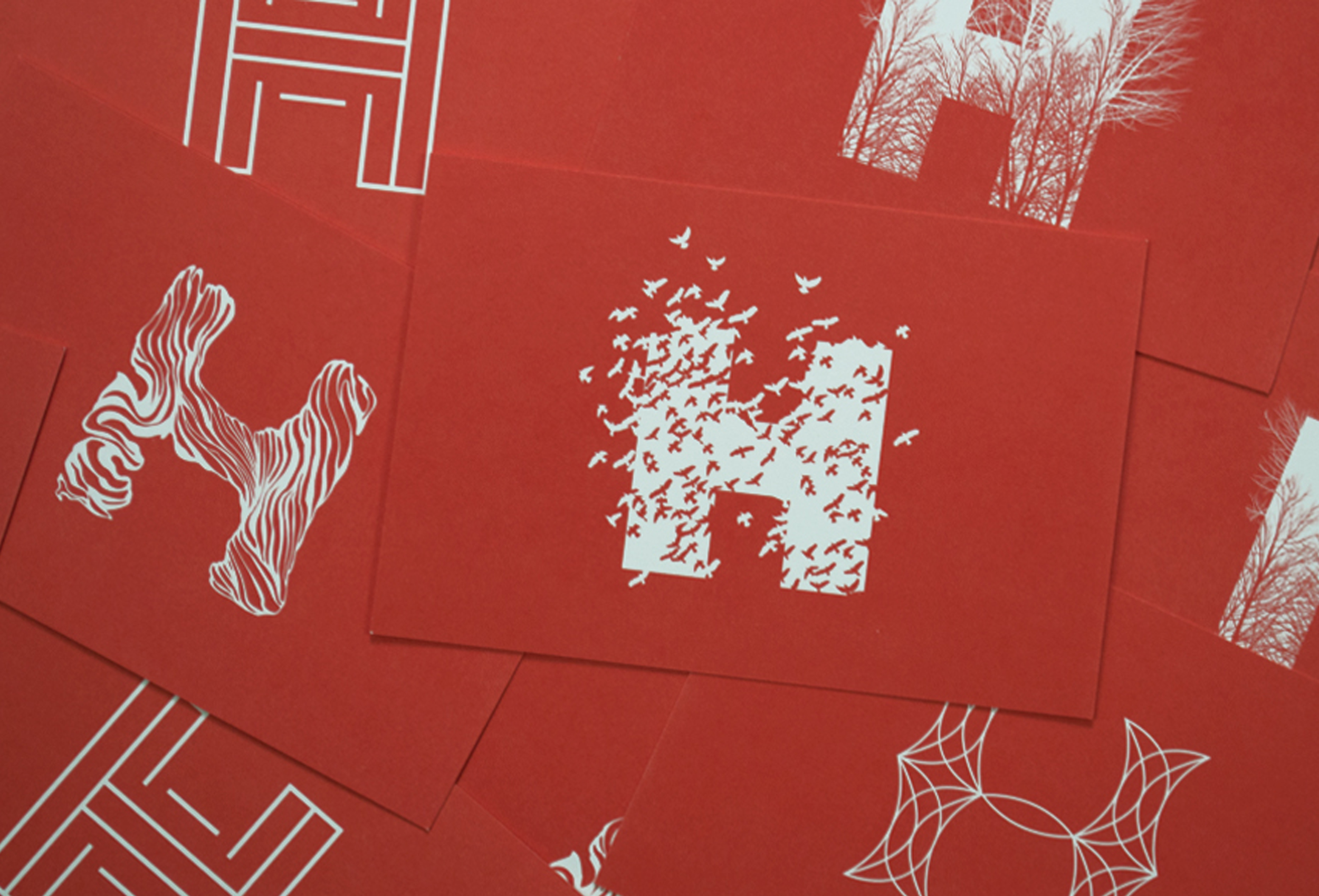
Halcyon takes its name from a mythical bird fabled to calm the seas and its representation of idyllic happiness, carefree tranquility and prosperity. The visual identity embraces this at its core. The transient "H" icons are embued with the ease of Colorado’s lifestyle and the air and grace of a different kind of luxury hotel.
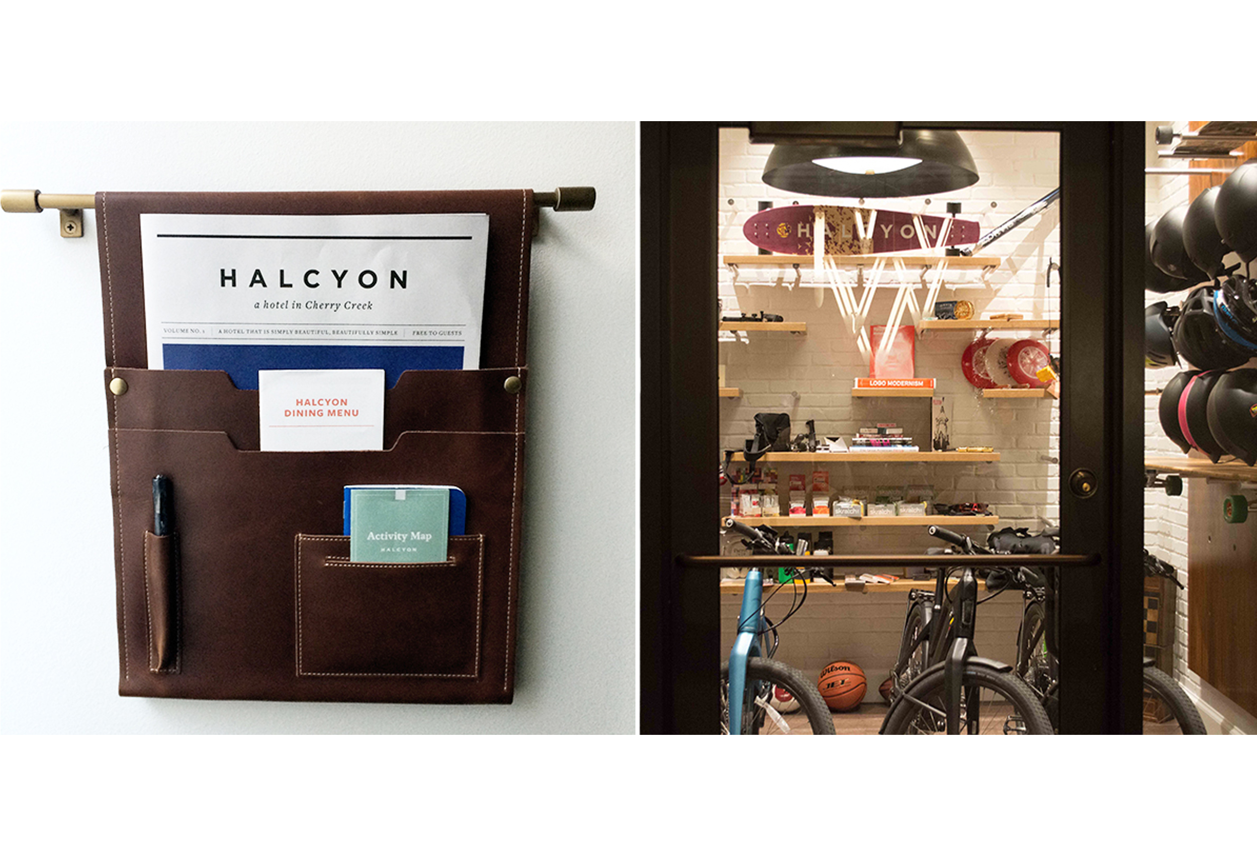
Halcyon brand strategy introduces compelling new concepts like a “Gear Garage” to give guests direct access to a test-run of the very best outdoor gear and gadgets or the opportunity to fly around the neighborhood on branded Vespas, bikes, and longboards. Hosts welcome guests in and gather around the “kitchen counter” to take care of checking in among other needs that make a guest feel at home.
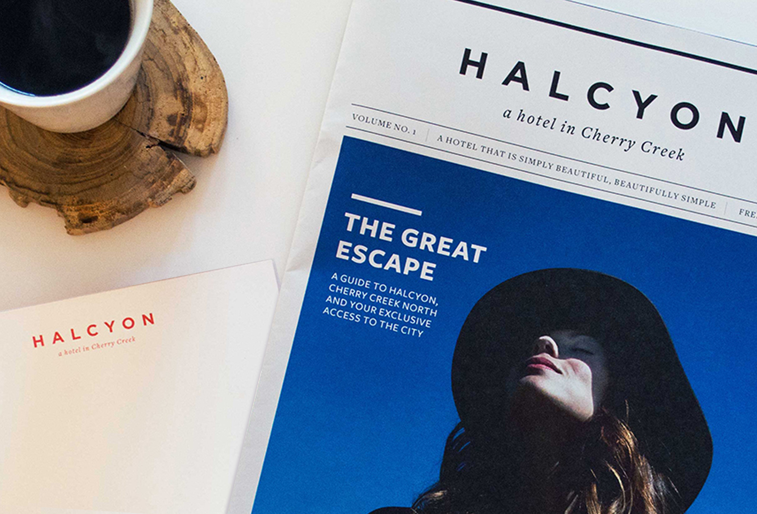
Halcyon identity takes advantage of simple luxuries through beautiful materials and clean applications. Rich in texture, but simple in style, it is luxurious, inviting, and modern.
VISIT HALCYON HOME PAGE →


Cooks science portraits
Cook's Science is a sister brand of America's Test Kitchen. Entirely digital, it brings reported stories and innovative recipes from the world of food and science into home kitchens. Made up of a curious team of cooks, scientists, and journalists, Cook’s Science is passionate about asking big questions, reporting the stories, experimenting in the kitchen, and developing foolproof recipes for the home cook. Instead of using photos, the team wanted a group of stylized portraits to match their new, modern take on food writing and a color palette to match.
SeE THEM IN ACTION →


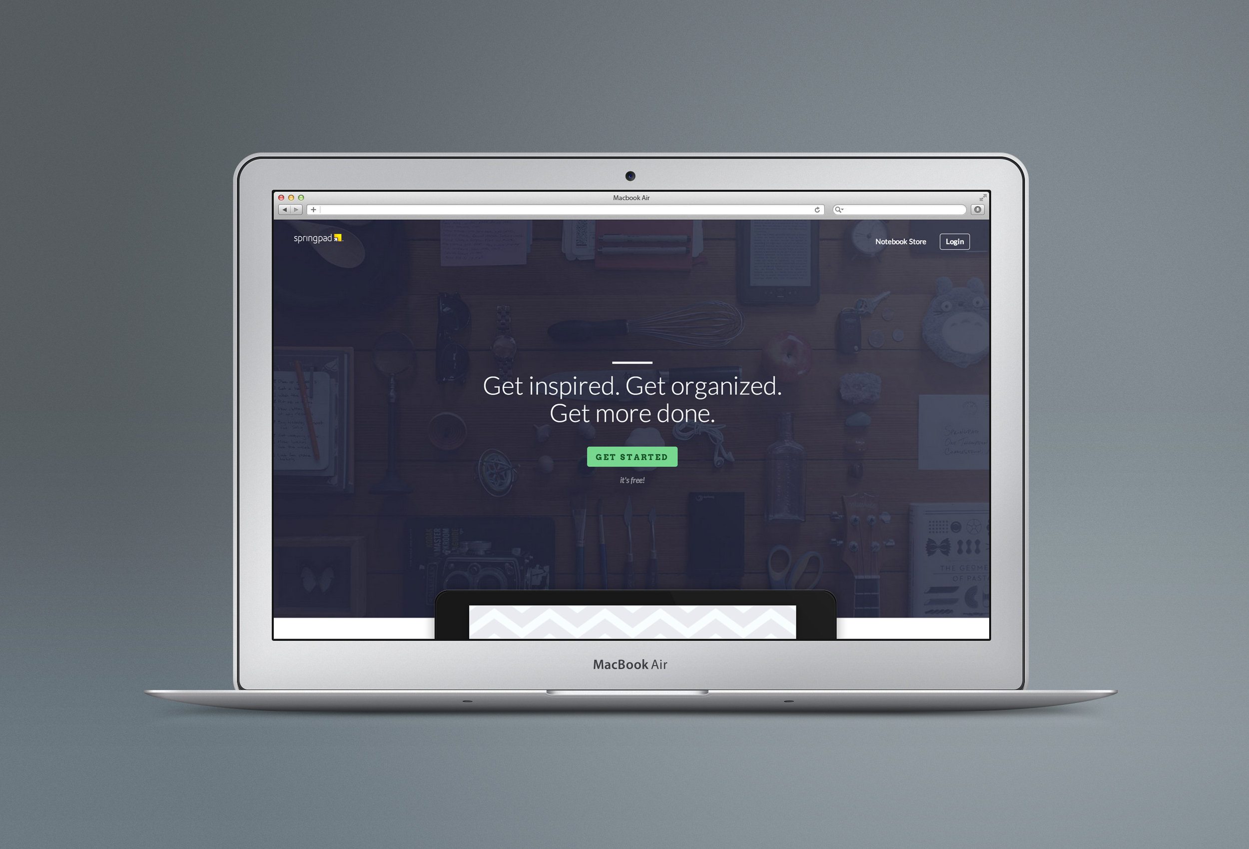
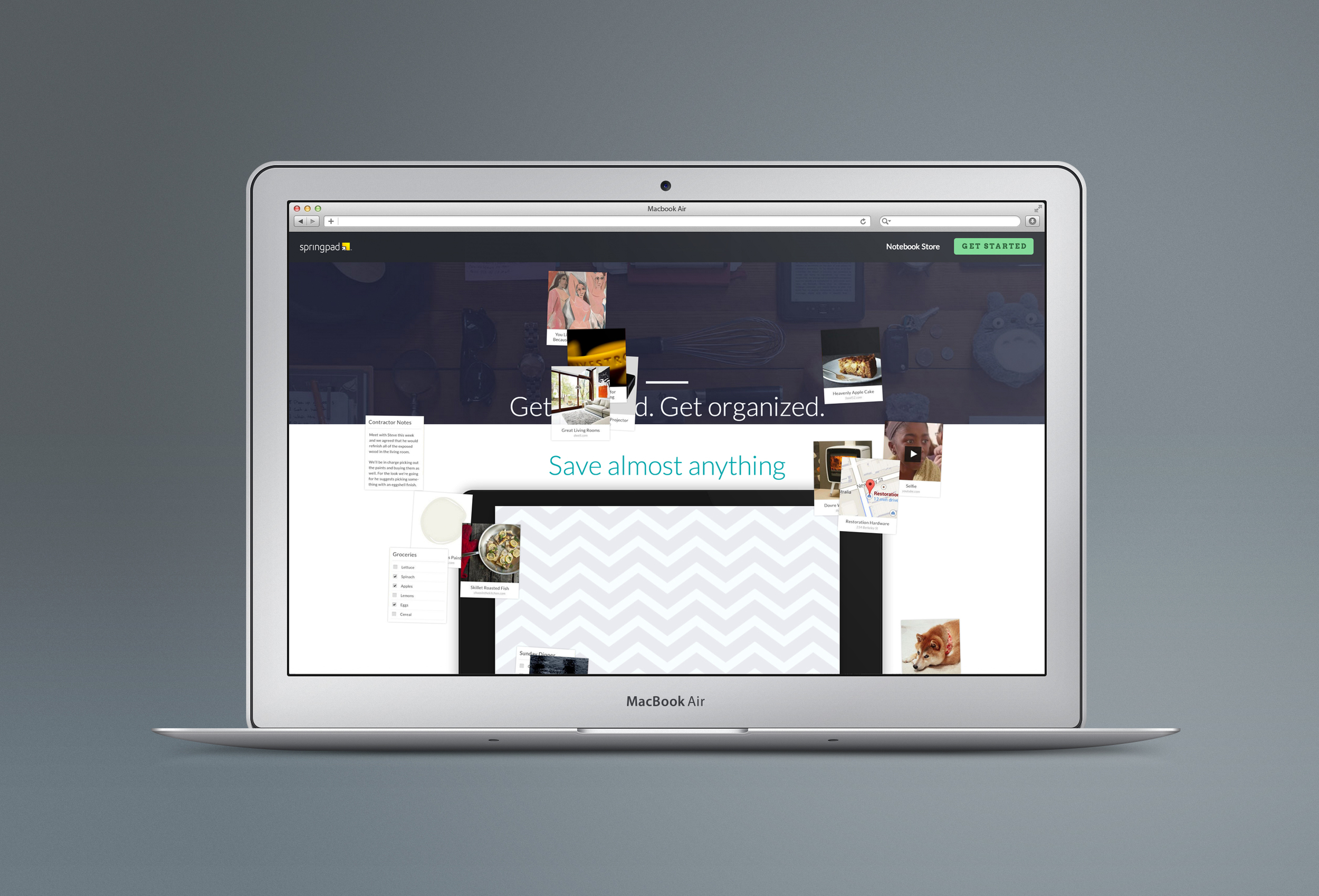
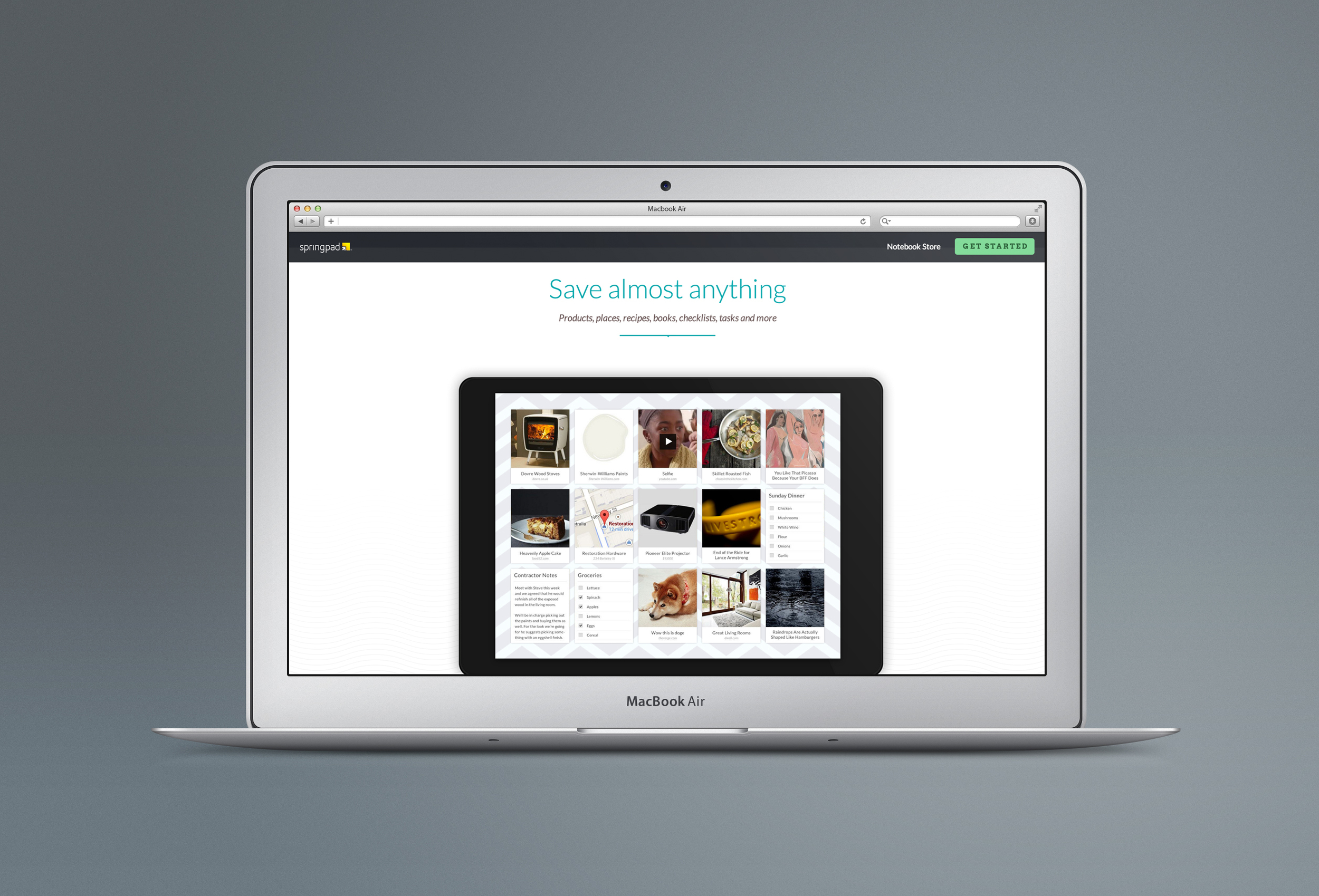
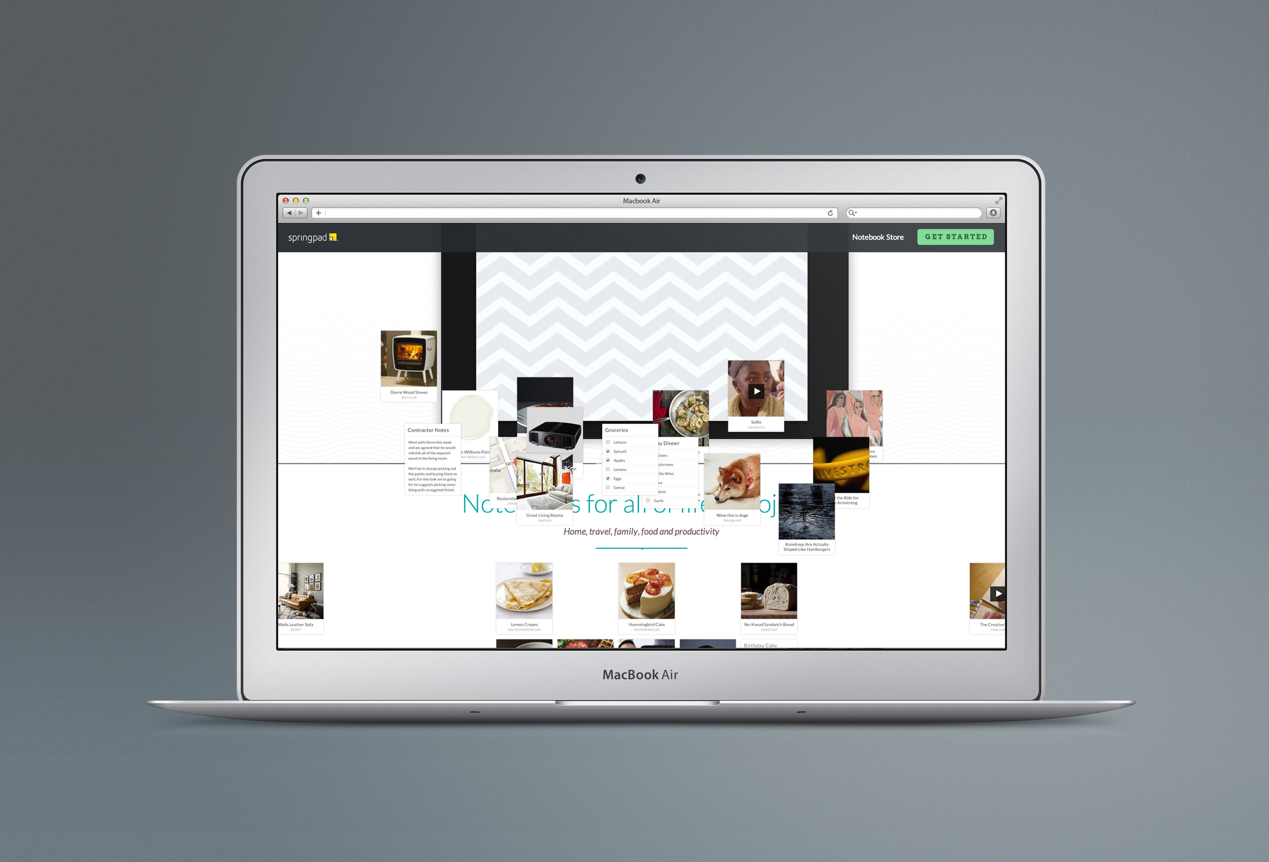
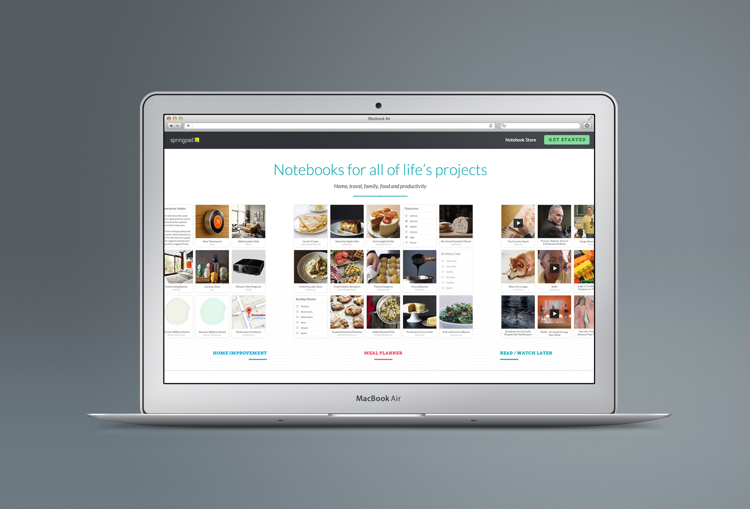
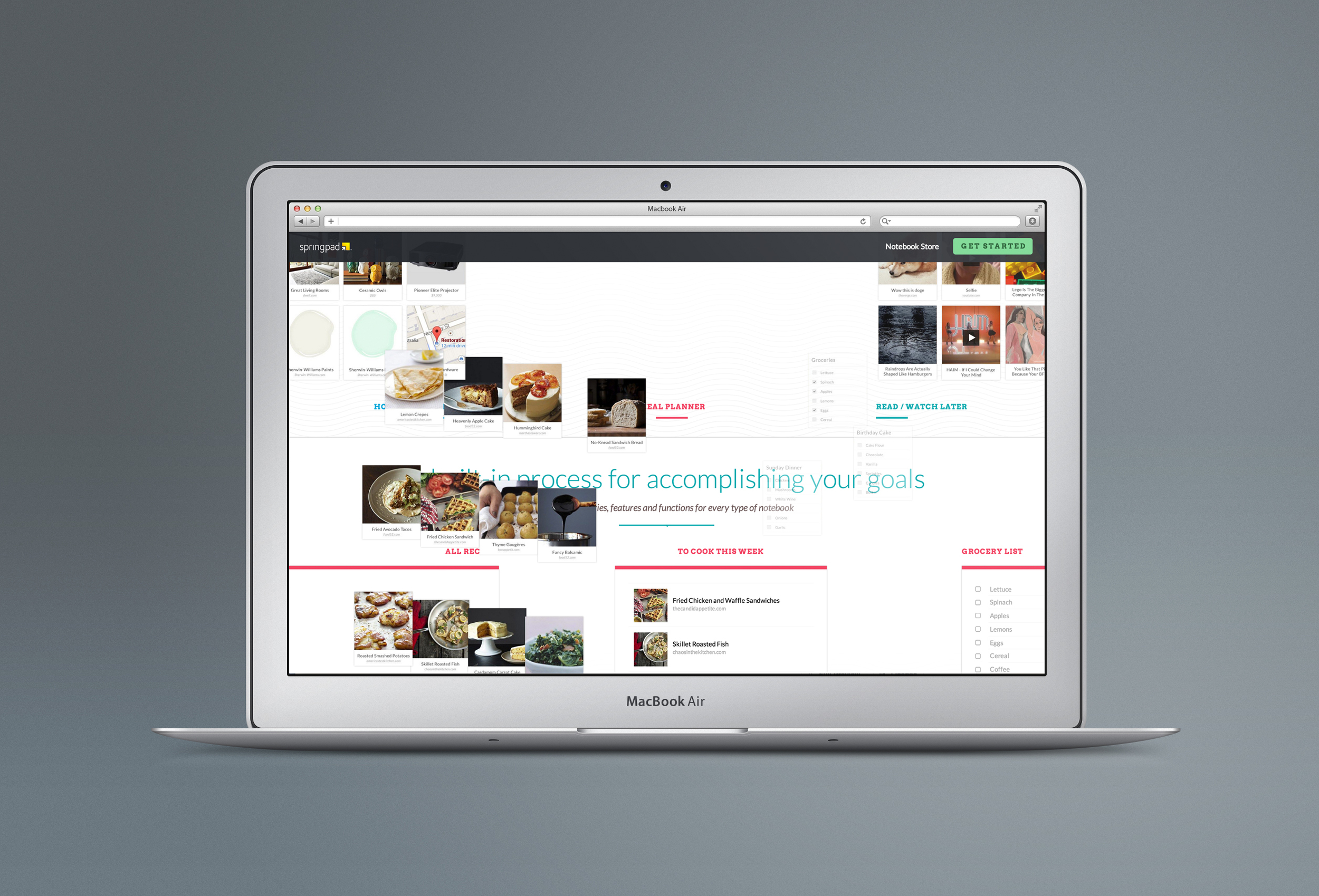
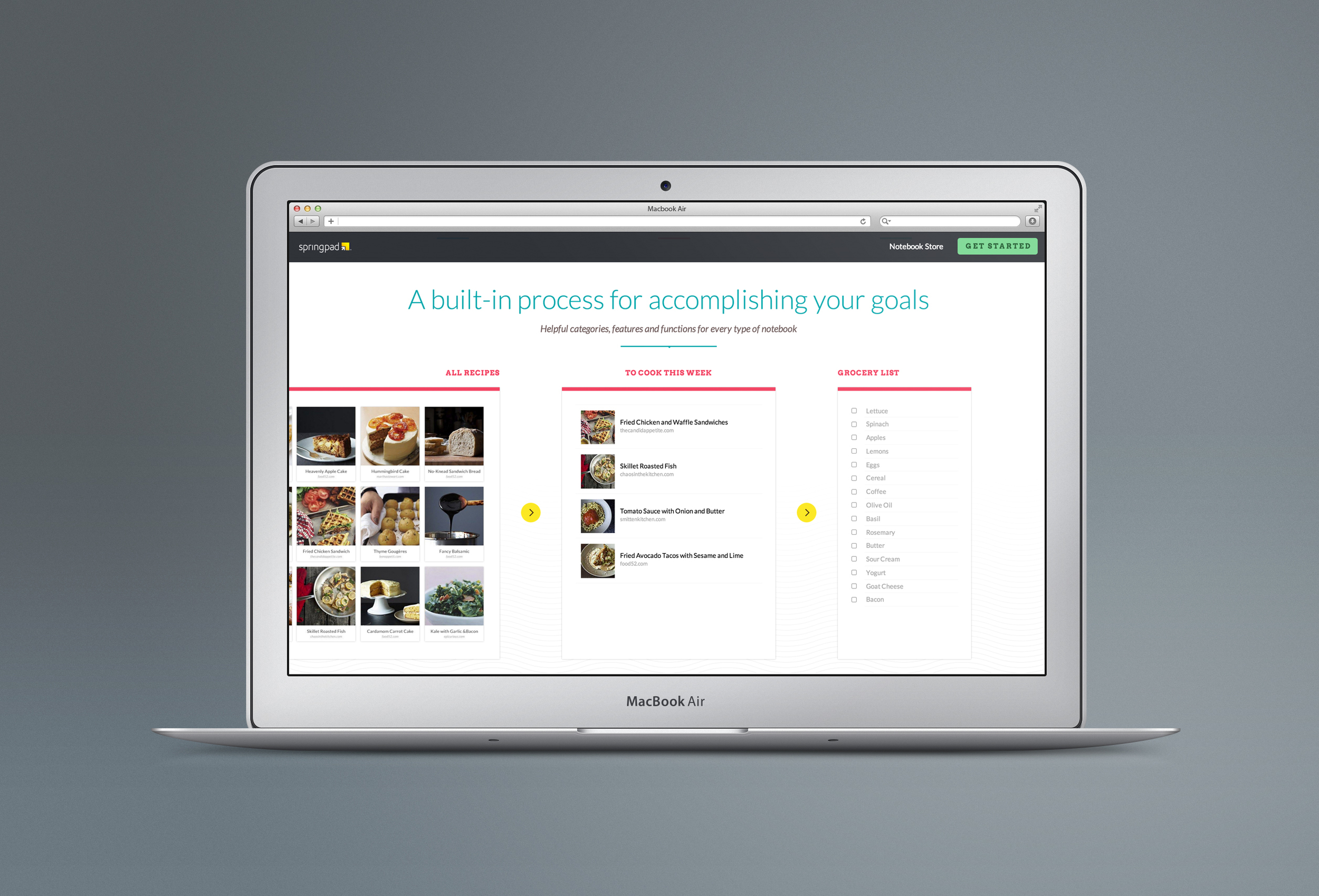
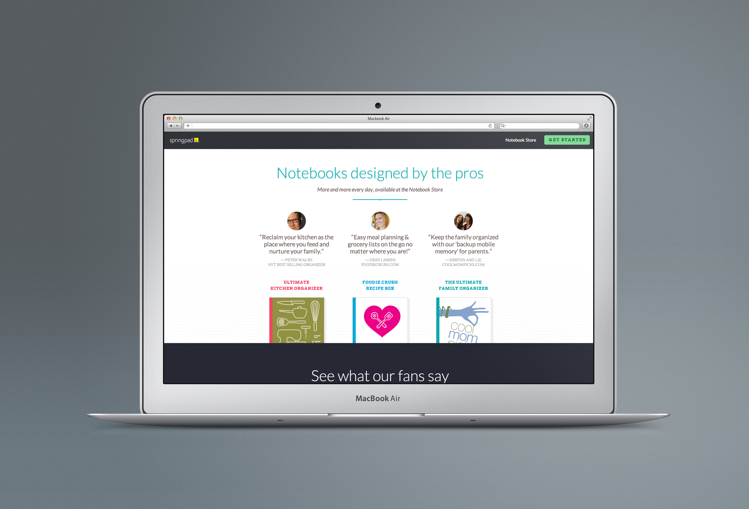
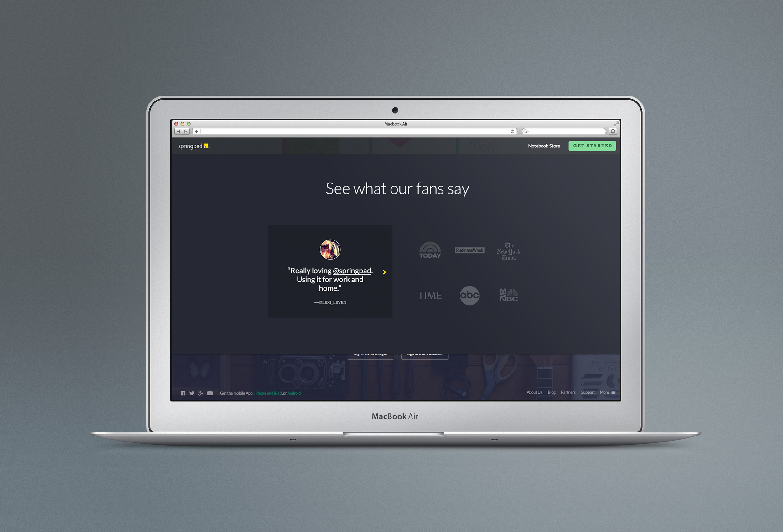
Springpad refresh
Springpad is a personal organization app that allows you to save a wide variety of information and store it in separate notebooks that you can access on your phone or on the web. The homepage was ready for a major makeover as the company tries to draw more users to download their product. The new homepage needed to serve as a simplified introduction to the app’s functions with quick previews of some of the more popular notebook types such as task lists, recipes, products, making check lists and more. To do this, the site was simplified and made to look more friendly with moving elements designed to draw the users down the page which is anchored in an easy sign-up field.

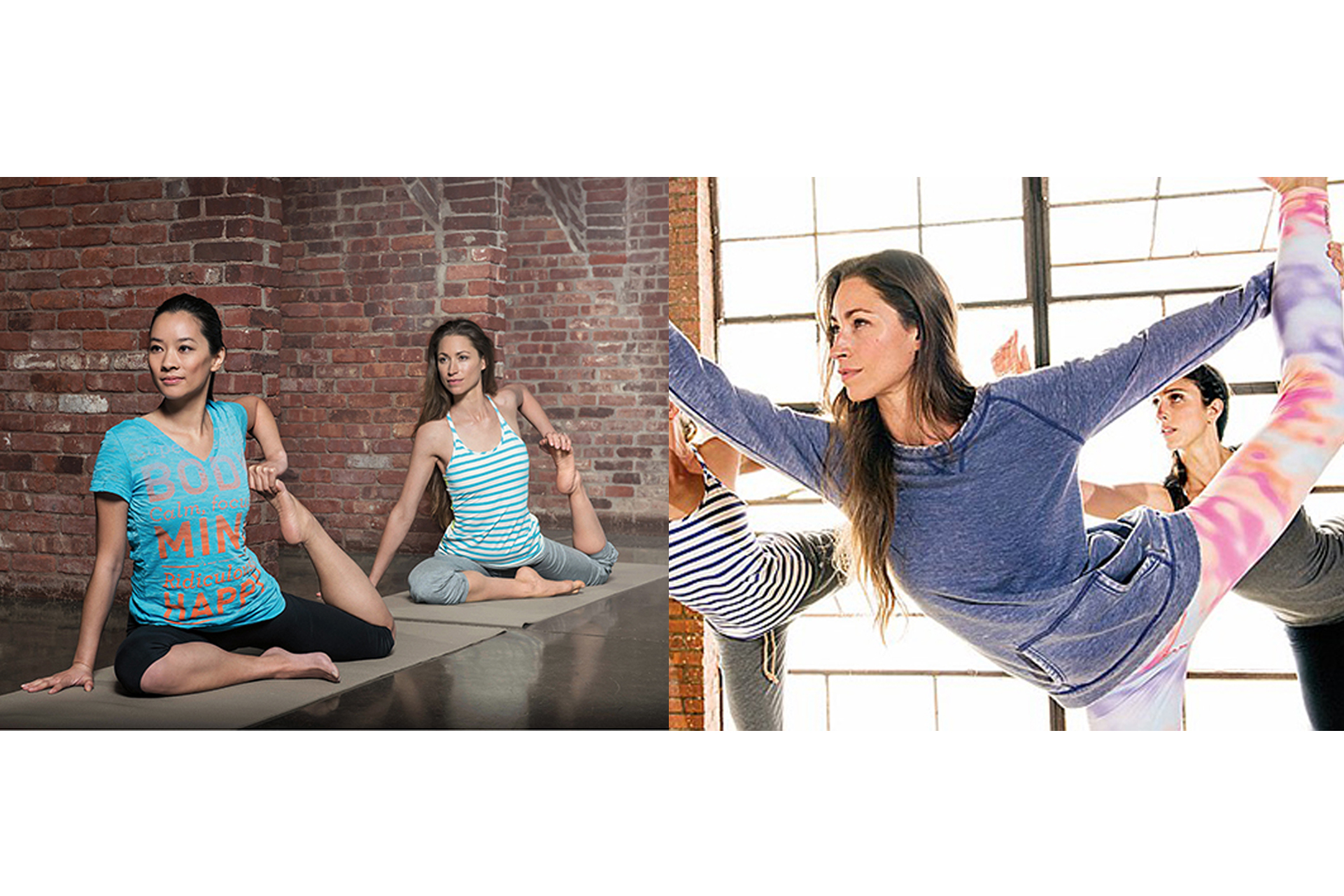
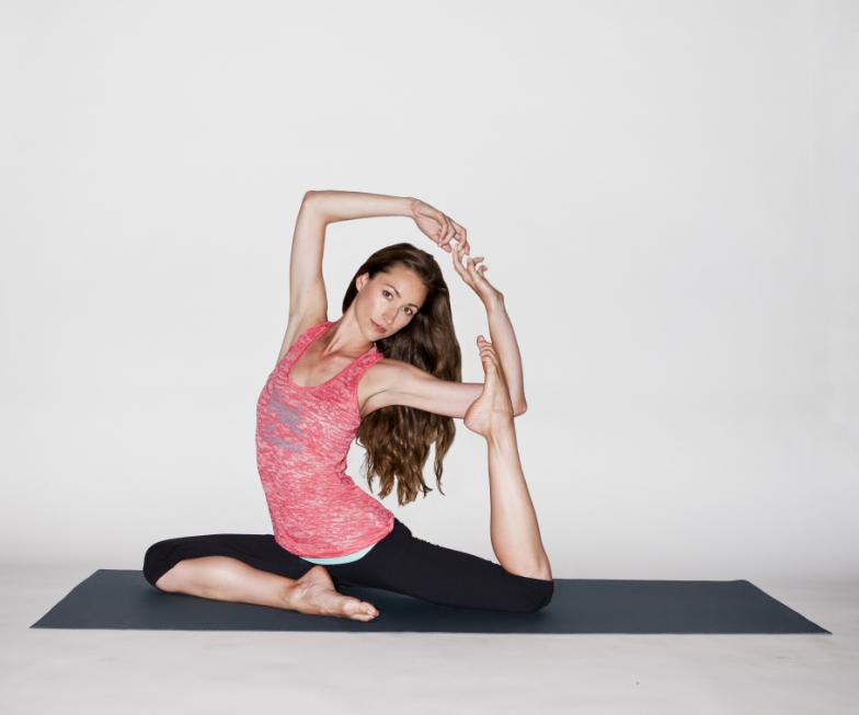
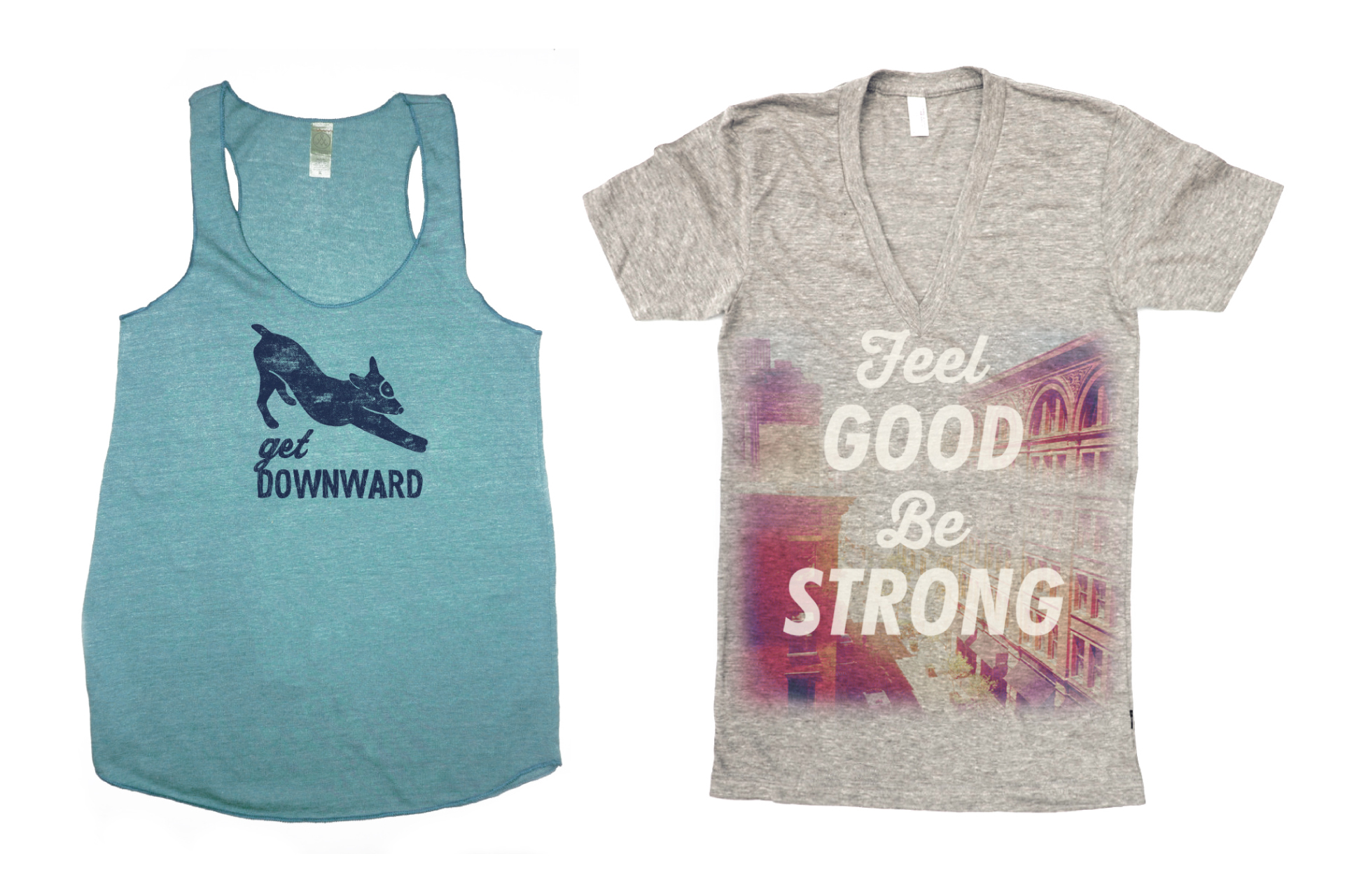
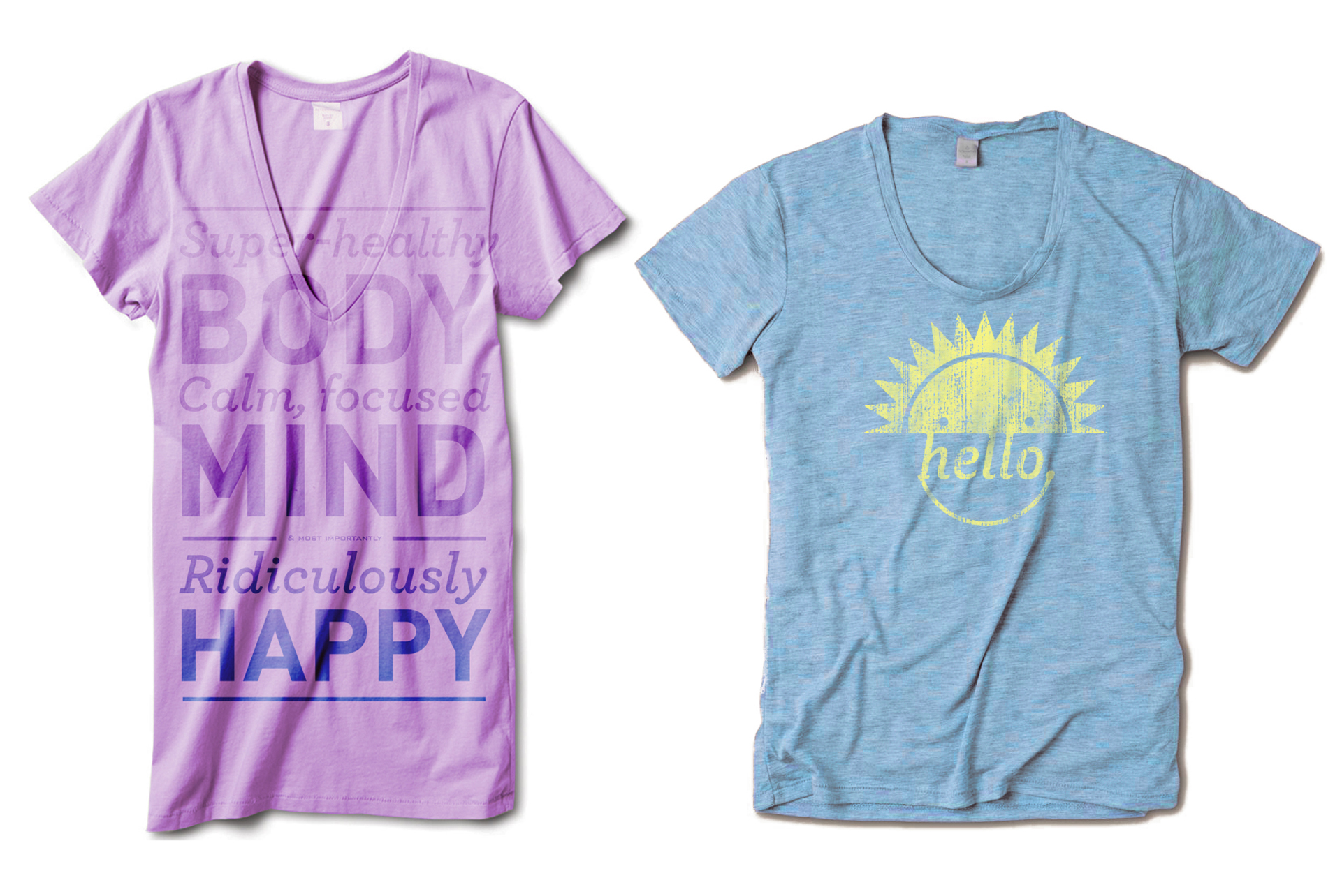
Rethinking Yoga Product
Yoga apparel is abundant and widely distributed with many yoga studios carrying product in a boutique-like setting. With private labels and many big name corporate apparel companies getting into the game, Reebok needed a different approach to stand out. Stepping away from traditional visual cues such as Indian motifs, Reebok yoga speaks to the practice’s purest goals: Feel good find the ease, be optimistic, and be YOU. The product keeps it simple, looks fun and colorful and stands out in the competitive market while still being functional and comfortable.
Reebok x Armani EA7: fashion & function
Reebok teamed up with fashion house Emporio Armani to produce high end runners and performance apparel. The goal was to combine Reebok's innovation and technology with EA7's sexy, sporty lines. The result was a collection with a contemporary vision for both collaborators with limited production in boutique doors.

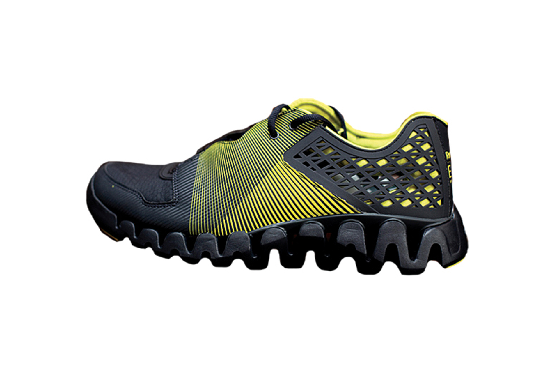
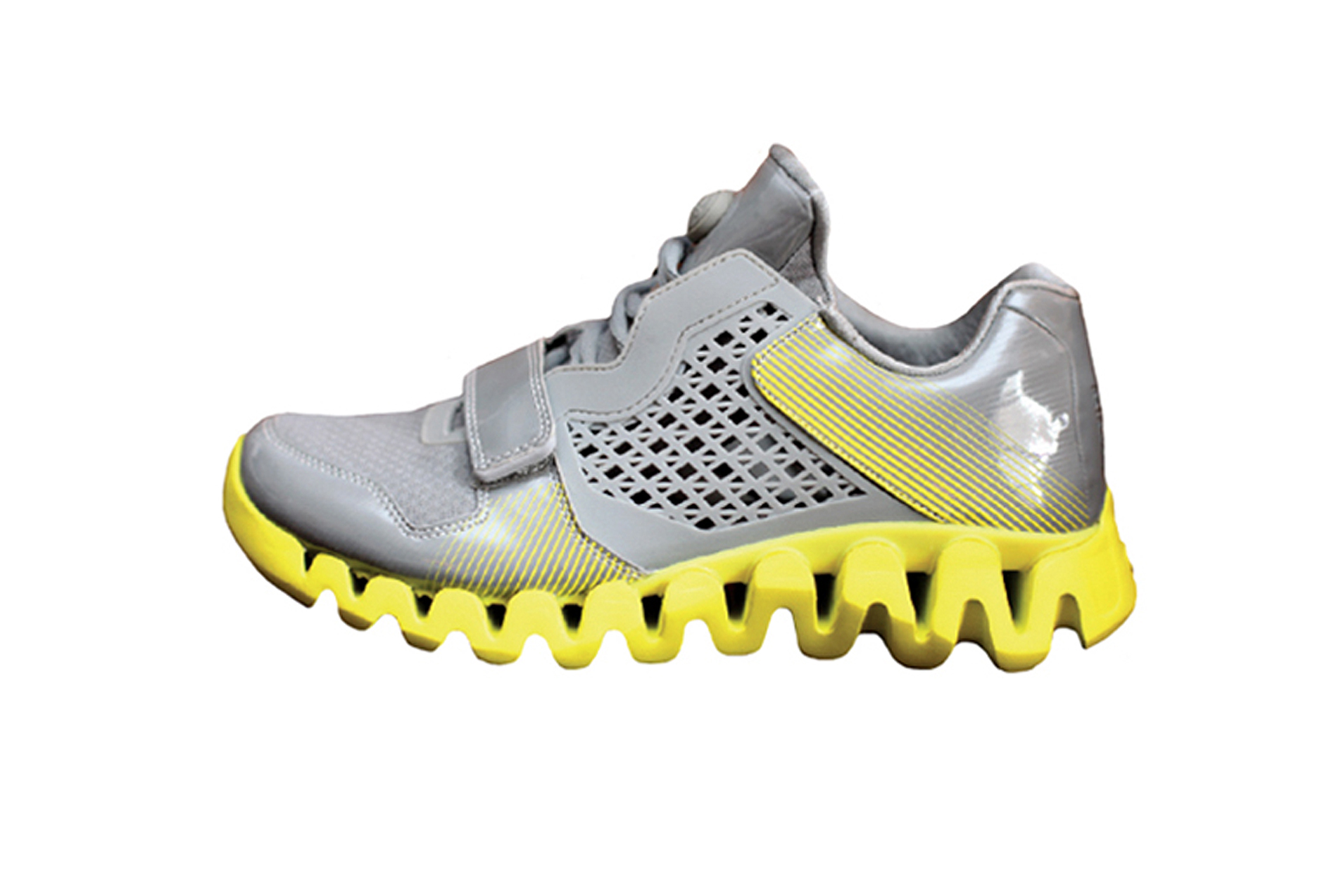
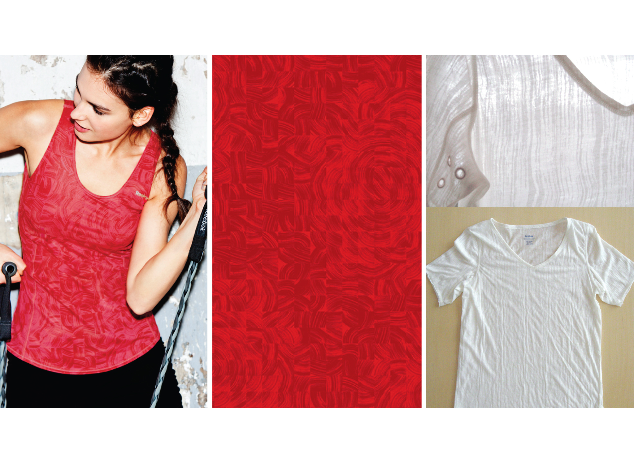
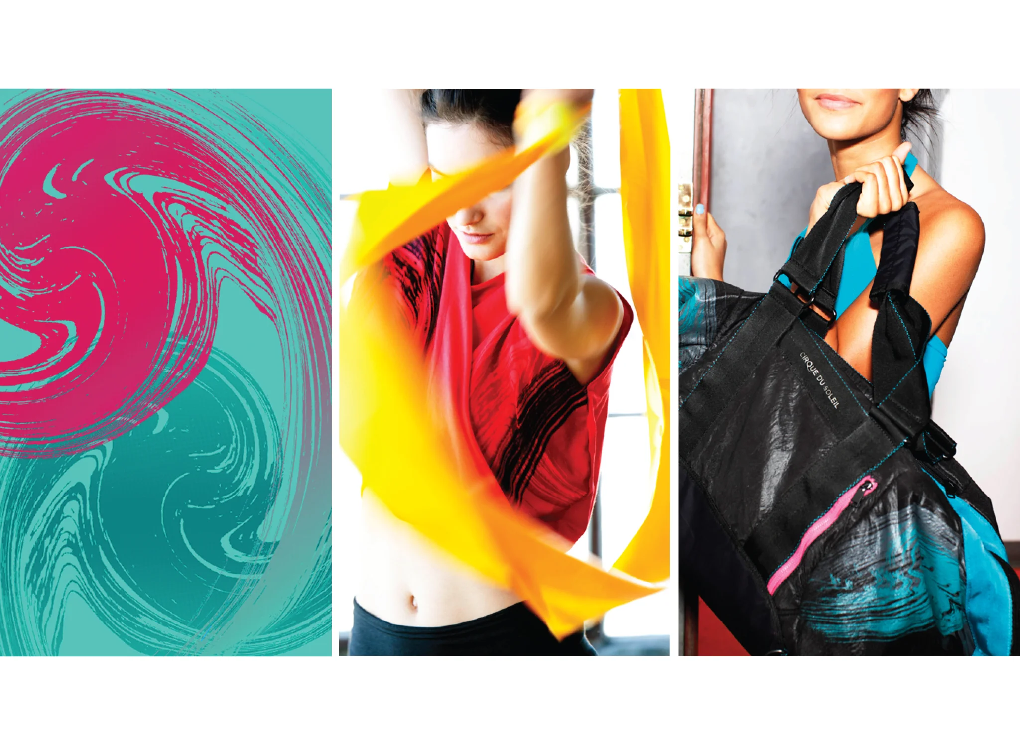
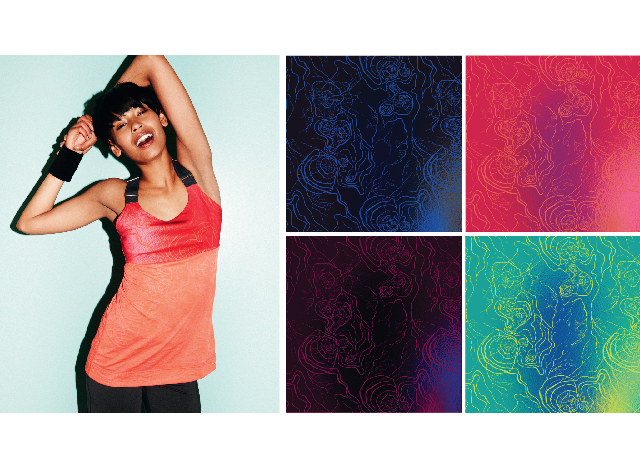
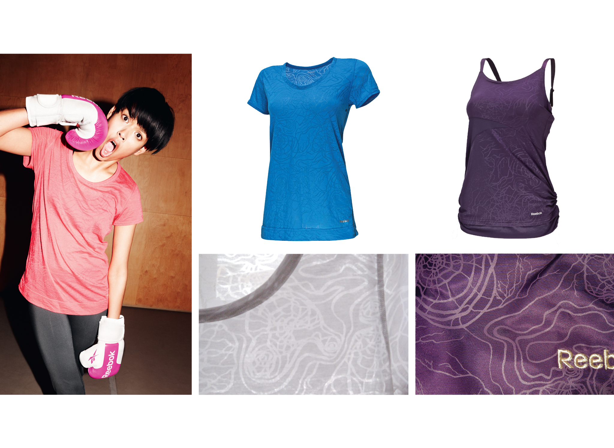
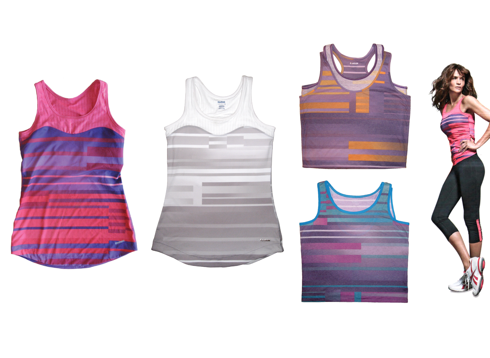
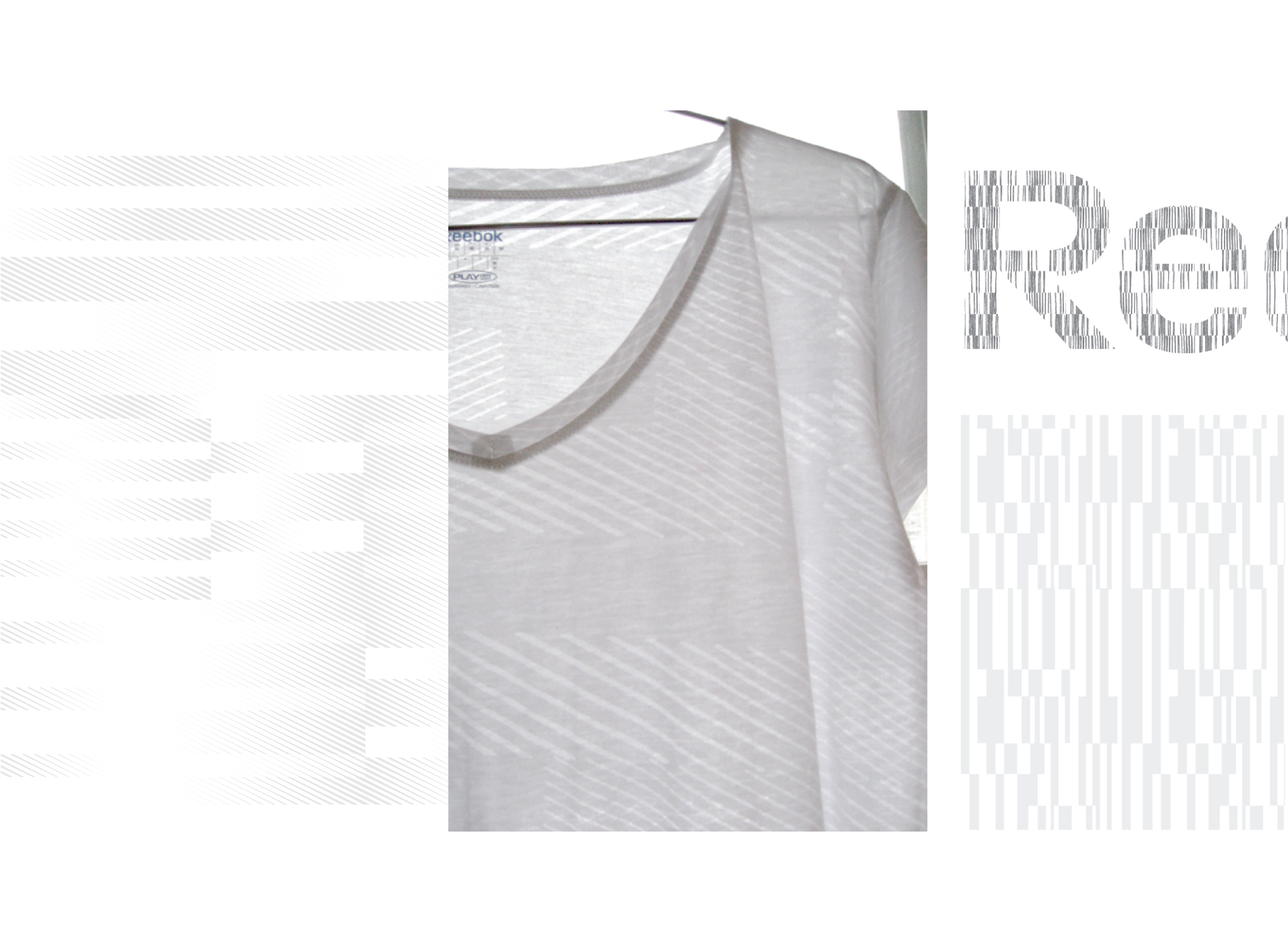
Reebok Women's Training
As the lead surface designer for Reebok Women's training apparel for more than three years, I developed trend stories and developed a diverse range of apparel and footwear graphics. With their history of being pioneers in the aerobics movement with their fitness videos and Freestyle studio footwear, Reebok wanted to make product focused specifically on a woman's movements with an emphasis on flattering lines and modern textile and material print trends.

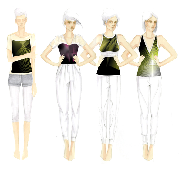
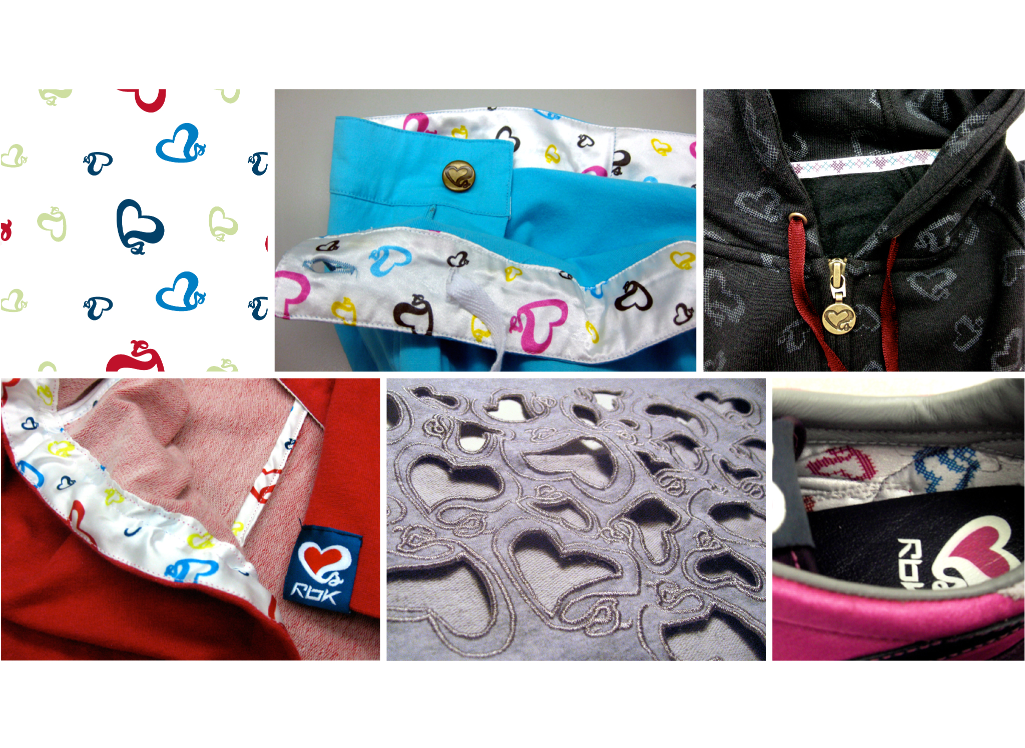
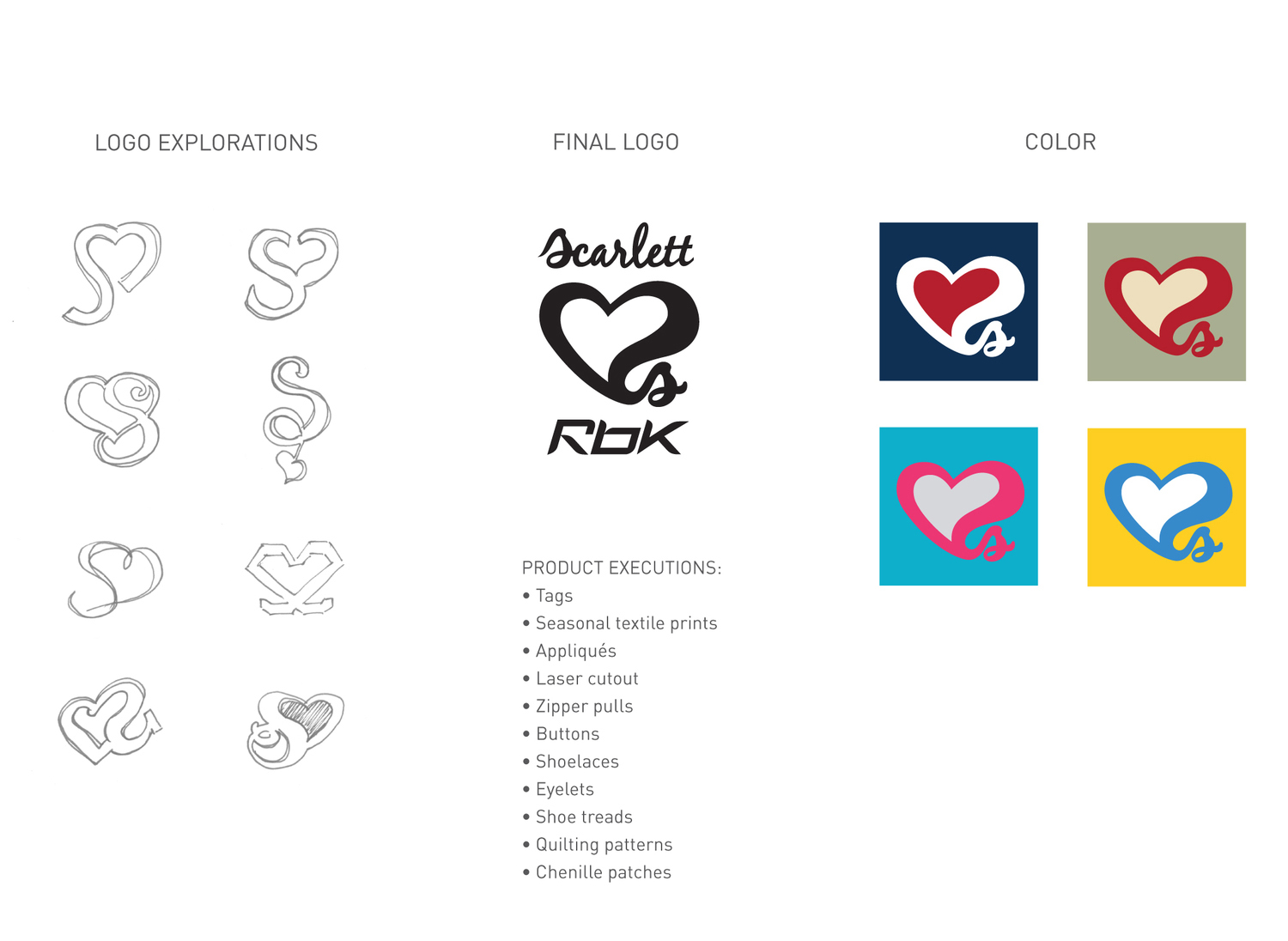
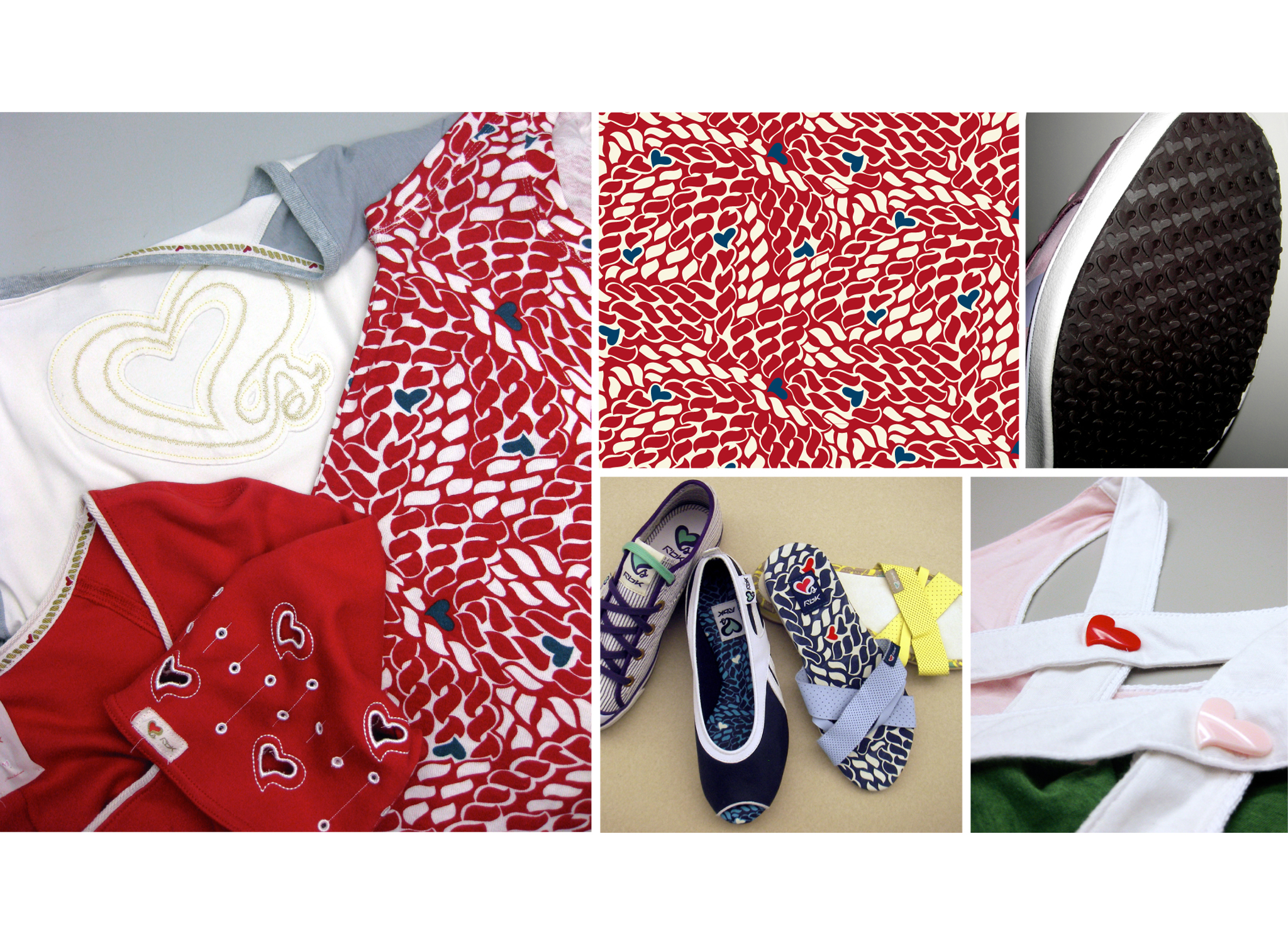
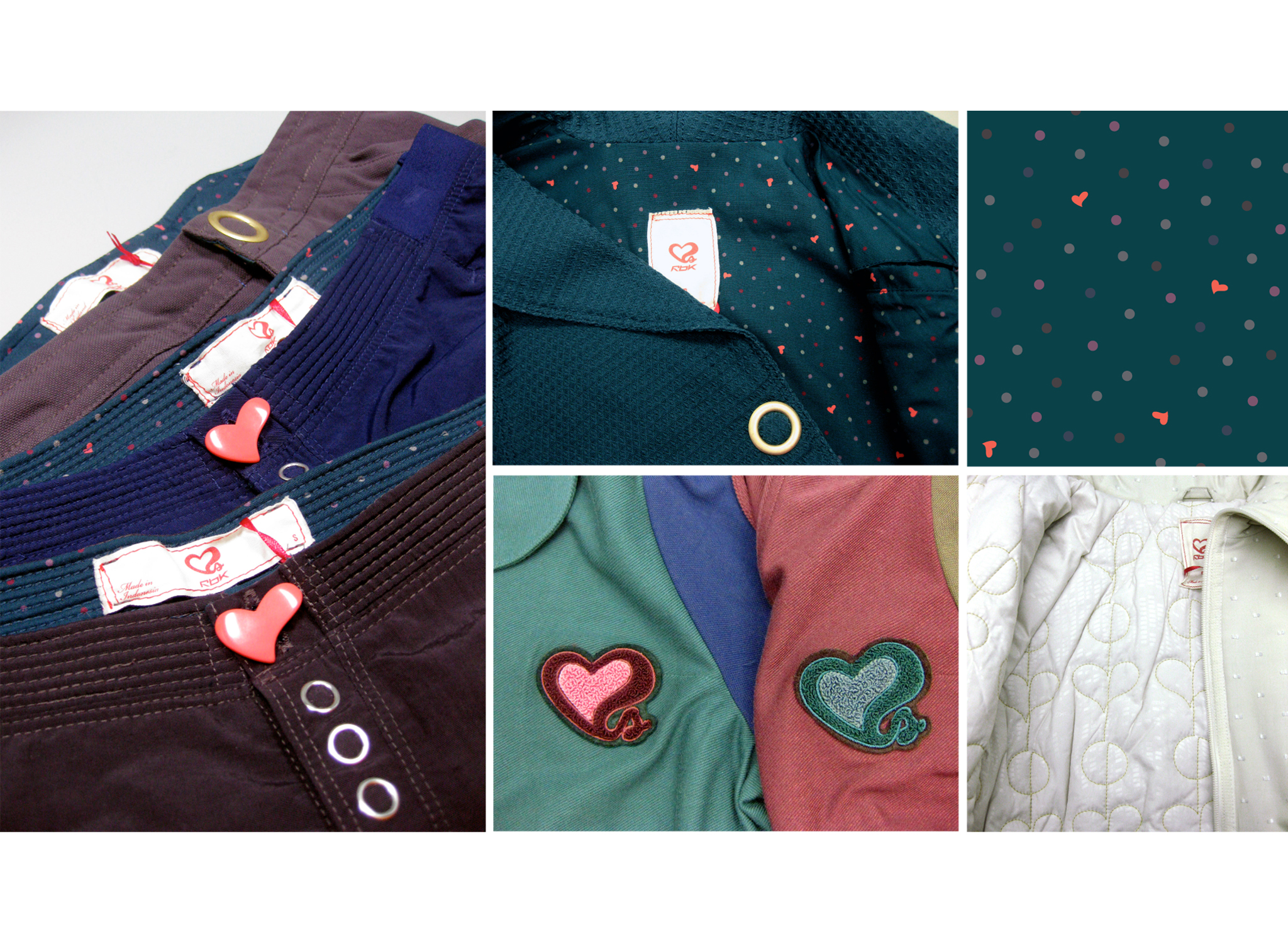
Scarlett Johansson Collaboration
For several seasons, Scarlett Johansson was an unlikely spokesperson for Reebok. Internally, the marketing story posed a serious challenge for developing sub-branded apparel. For the logo, her initials, SJ, were sketched out in various configurations to form a heart shape. The campaign for "Scarlett Hearts Reebok" was pitched as a marketing solution, combining a positive affinity for the brand by a famous name and the ever popular heart symbol used by many fashion brands. The heart was a bold carrier of color and could be applied to patterns, trims, and functional elements on the product. The collection was influenced by retro athletic pieces mostly from the 70's and 80's.

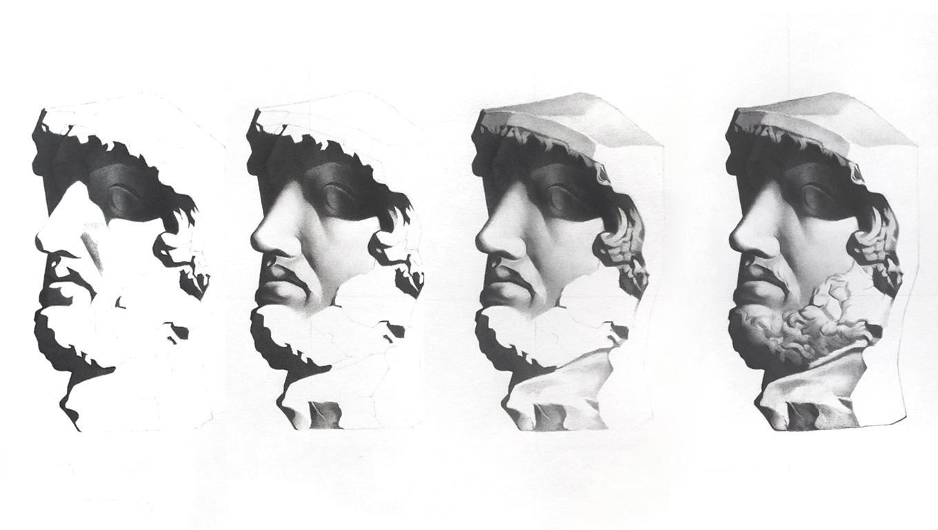
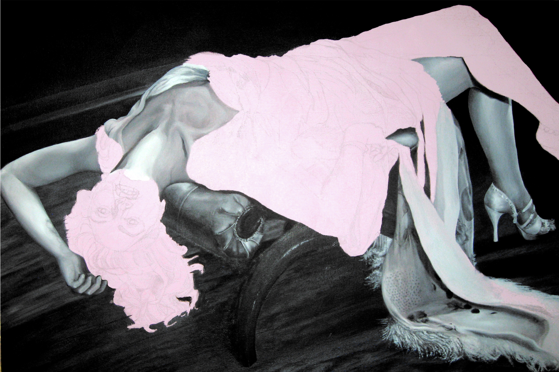
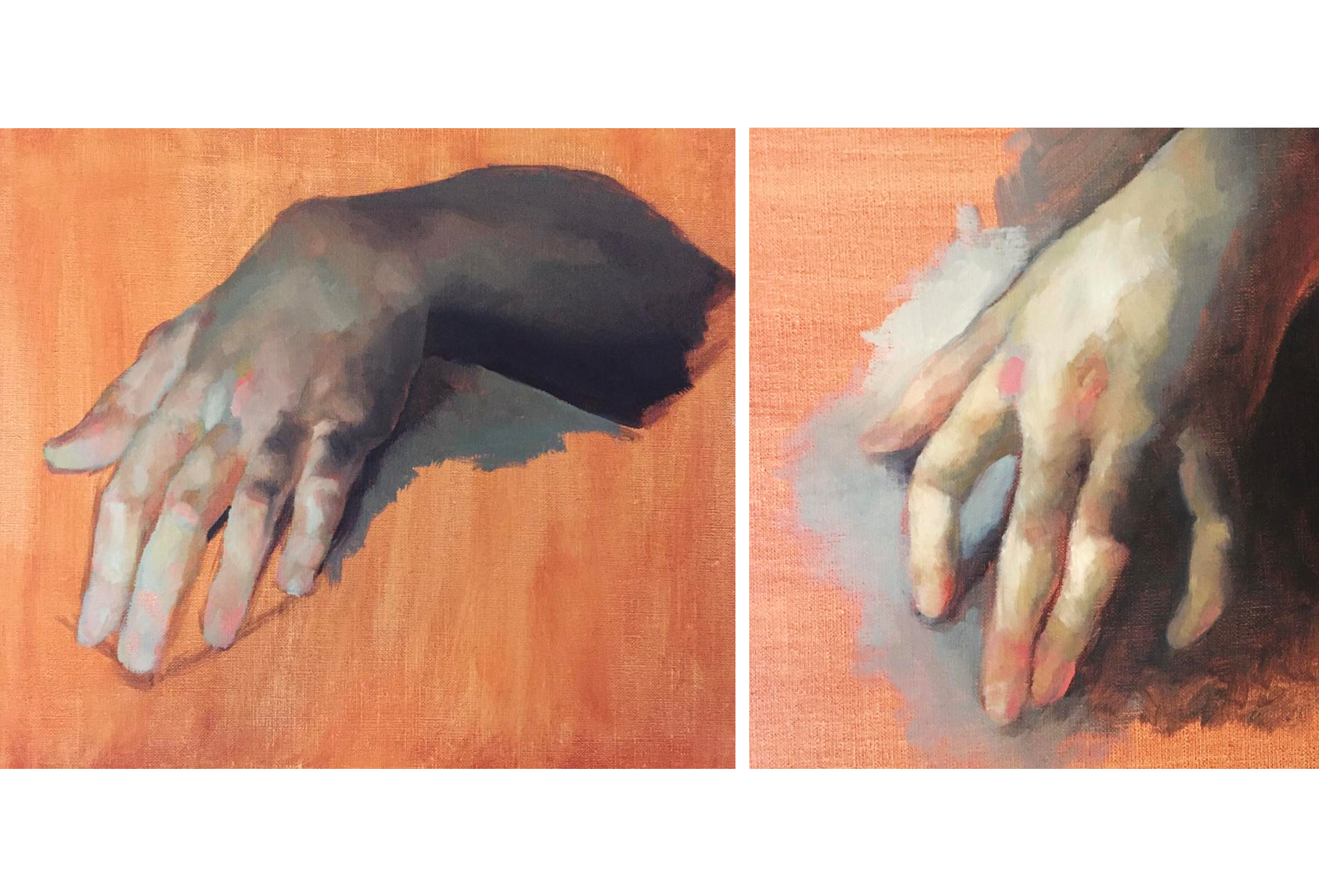
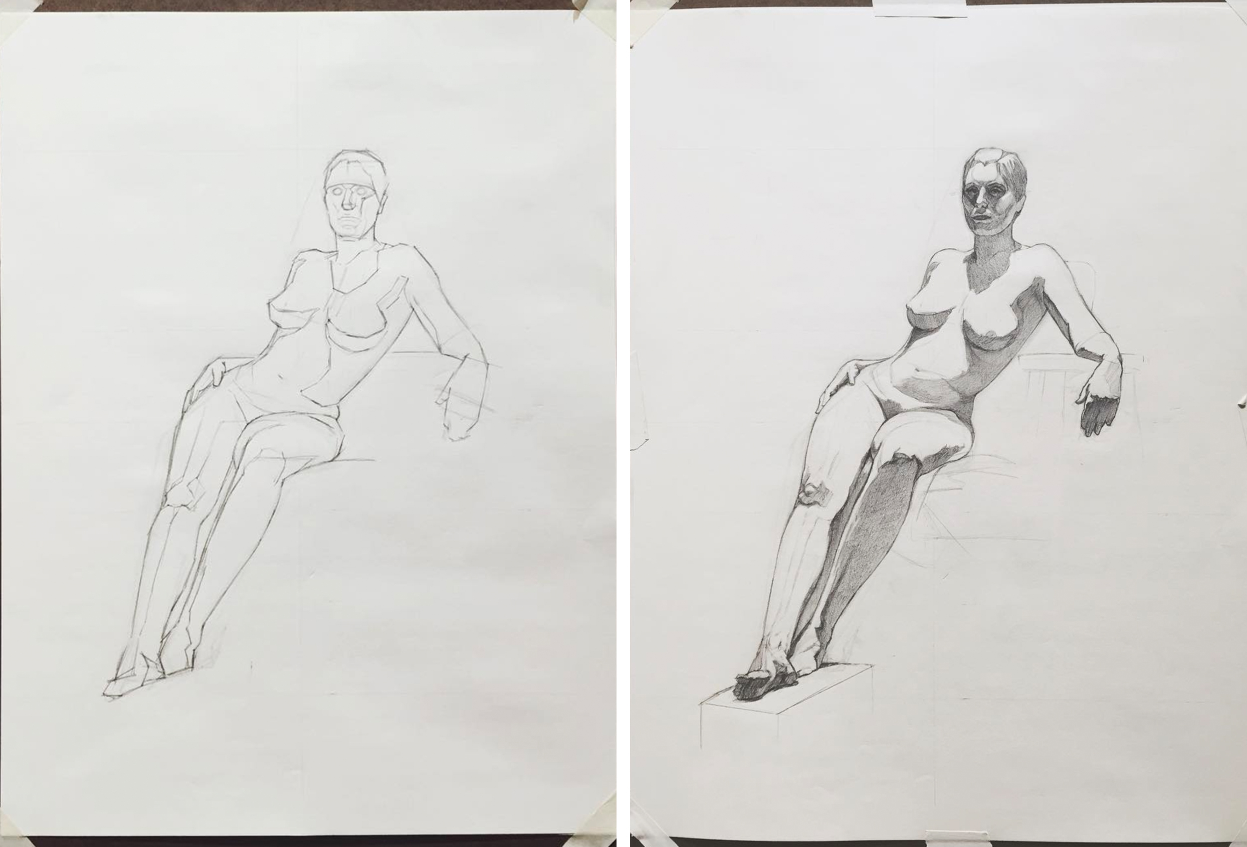
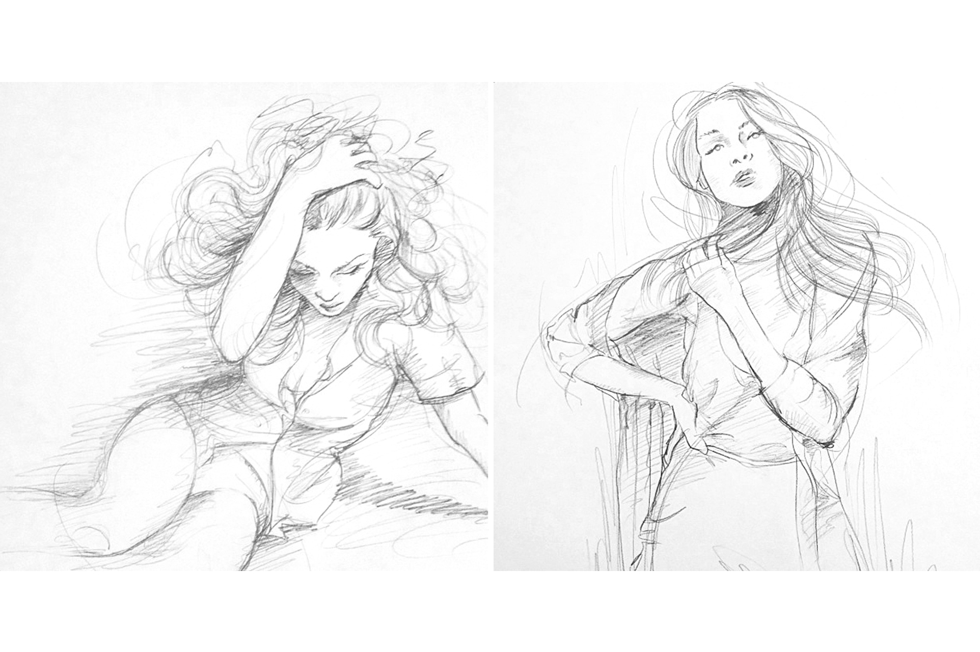
Sketches and other work
In my free time, I like practicing my craft in different mediums. Most often, I can be found sketching, putting paint to canvas, or writing prose and personal essays.